This is an edited collation of a couple of blog posts I wrote a couple of years ago over at my old blog (I am recognising that I need to start putting posts up there, too, and not keeping absolutely all my new writing here, but that’s a thought for another day.
I am fascinated at the glimpses we can get into different illustration processes and love seeing timelapses popping up on my Instagram feed or watching some of the videos other illustrators share on their Substacks, Patreons or blogs.
This isn’t for the purposes of copying them, but just to get an insight in different ways to go about things, I think. Sometimes you’ll see a really useful shortcut or tool you’ve not fully explored. Other times you’ll just appreciate the differences and understand that, while you love a certain illustrator’s work, their process is not one you’d want to explore – perhaps because it takes too long, or because it feels too repetitive, or because it doesn’t give the opportunity for looseness and embracing mistakes, or because it’s too digital, or too messy and requires a bigger working space than you have ...
I think non-illustrators seem to also enjoy watching process videos, and reading about how we go from text or brief or idea to illustration, through sketching or not. Art directors (the few who aren’t also illustrators or creatives, because I think many of them have a foot in both camps, as it were) and other illustration commissioners find it helpful, too, because it can give an inkling of how long an illustrator will take and at what points they (the art director) will get the opportunity to guide the process and to request changes. It can also guide them on what type of briefing they will need to provide, because there is a fairly wide range of ways to go about briefing an illustrator (hmmm… idea for a future article).
So, in sharing my process here, I’m hoping to provide something useful for other illustrators – perhaps you’ll spot a neat little trick that you hadn’t tried before; perhaps it will help you understand that you prefer proper paints and pencils; perhaps it will make you try out Adobe Fresco and find something you love in there – as well as for any illustration commissioners reading this, but also for my more general readers, because it’s a little glimpse into a creative mind, and hopefully that’s interesting. How lucky we are these days to be able to see into so many different creative minds around the world?
I almost always start with sketching and I almost always do that sketching on the iPad. I work on an iPad Mini (5, with Apple Pencil first generation), which is really very portable. It fits in my small bag along with a notebook, mini sketchbook and a pen and pencil – and my purse, phone, a reusable tote bag with a beautiful pattern on from the V&A, my inhaler, my house key, my glasses and usually a hair band or two!). I am seriously lusting after the new iPad Pro that came out this year, which I would want to get with the new Pencil Pro and also the Magic Keyboard. But I suspect I would still hold onto the mini (or, if I have the budget, update that, too!) because I genuinely love the lightness and portability of it (especially given my penchant for hopping on a train across the channel).
And I do the bulk of the work in Adobe Fresco (sometimes absolutely everything, in fact). When I sketch in Fresco, I sketch with the pixel pencils and my favourite is the charcoal pencil, which I *think* is one that comes with Fresco. If you didn’t know this already, Adobe Fresco allows you to work in both pixel and vector and you just have different layers for each. By far the largest bulk of my work is then done using vector for the final. But, if you’ve been following me for a while, you’ll know that I have started digging deeper into using the pixel brushes, and am now producing probably half and half vector and pixel.
I do also sketch on paper and then bring a photo of the sketch into Fresco, rather than sketching direct in Fresco. However, usually, for commissioned work, I will sketch within Fresco, using layers, because then it’s a lot easier to make any changes the client requests to the sketches – such as moving things around, or redrawing just one person from a different angle, or adjusting the background.
So, I’ll start with sketches of some kind:
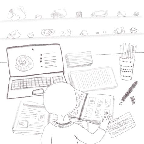
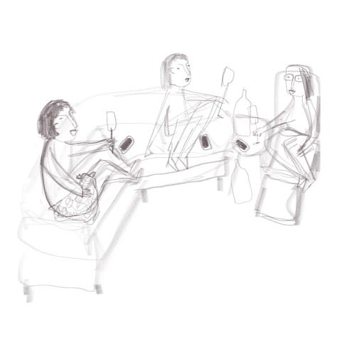
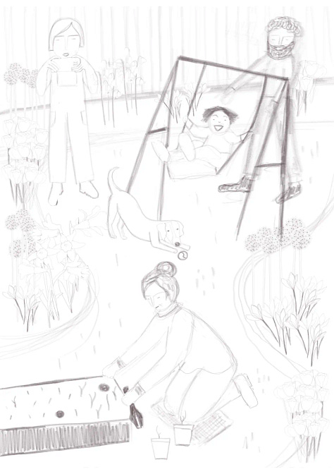
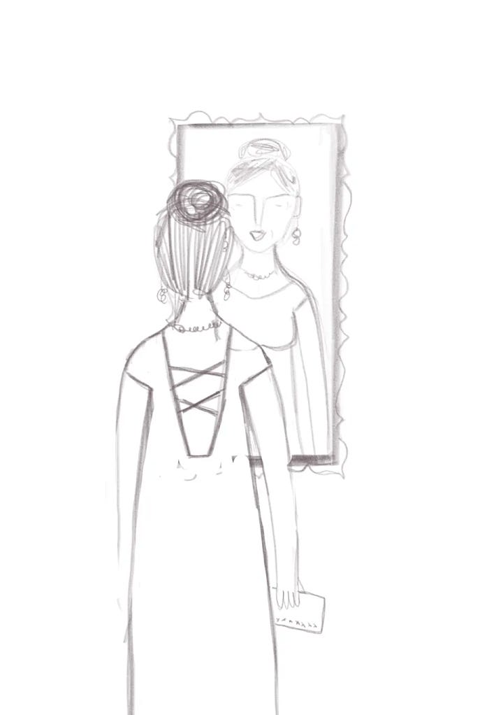
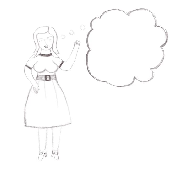
Some sketches are super quick to draw, some take a few iterations (especially if it’s client work, where they might realise they need some extra bits, or to change the composition, and so on, though I also like to sit on a sketch for a few days if I have time, because then I will often spot tweaks to make or potential for rejigging the composition) and some take quite a while, especially when they incorporate a whole scene.
As I mentioned earlier, my digital sketches are almost always in layers, so that elements can be moved around. Sometimes I merge a sketch down before starting to colour, especially if it’s very complex, as it can slow down the iPad if I don’t. But I prefer to keep the sketch layers, if I can, as then I can hide everything I’m not currently drawing in colour so as not to distract.
Here are a couple of sketch process videos:
Sketching is almost always the part of the process that takes the longest. It can often also include researching reference images, too. Sometimes I’ll gather a number of photos of people in a particular kind of pose or, if I need to draw a specific flower or an animal, I’ll gather a number of photos and then draw based on a combination of what I see in those photos. I would very rarely draw directly from a photo without making a good number of changes, even if it’s a photo I took myself. Because it’s in the simplification and stylisation that I bring some of myself into an illustration. A straight trace of a photo is not (to my mind) truly an illustration, though it does still offer a very different result and a clear human hand to using some ‘art’ filter. It can also be useful to do at first in order to study and get a feel for a particular subject.
Often, when sketching a scene, I will mess around with the composition and scale quite a bit before feeling happy with it. I tend to do sketching with silence or a particular music that fits the feel of the piece. It’s concentration work in a similar way to editing (with my educational publishing hat on).
I then usually group the sketch and put it on top with a multiply blend mode, so that the sketch will appear on top of what I’m drawing. And then I go in and draw all the elements bit by bit – again, everything is kept in layers, and I group the layers together, so that each person will be a whole group (and they probably have their head and hair as a group, their legs as a group, etc.
When creating vector illustrations, I use flat colour and I tend to draw with a customised vector brush , mostly using my default customised brush. (Roundness = 50%, Angle = 90°, Taper Mode = Velocity, Begin and End Taper = 0%, Pressure dynamics = 100%, Velocity dynamics = 0%)
I have a library with my go-to colours, which I update now and then – at least once a year, sometimes two or three times. Keeping a consistent colour palette (which tends toward a lot of bright colours, as you may have noticed!) is definitely a part of my style. I will sometimes pull out a handful of colours for a limited palette, but they will still come from my default colour library (as I did recently for #theydrawtober over on Instagram). And, as it’s a Creative Cloud library it’s available to me within Adobe Fresco, whether I’m on the iPad, my Surface Book or on my desktop and using the Cintiq. (And it’s also available in the desktop Illustrator and Photoshop apps, so I never have to guess or eyedrop.)
Here are some videos showing the colouring stage:
Colouring is usually less time-consuming than sketching, though for some particularly complex pieces it can take longer. Sometimes I can cut some time by duplicating elements – for example, in the garden scene above a number of the flowers are used multiple times. Colouring can be quite a mindful and calming part of the process, but it’s also a less brain-heavy one, which means I will often do it in front of the TV or listening to podcasts. Sometimes, the colouring can get a little tedious, so having something else to concentrate on helps.
For simpler illustrations, and for a more ‘go-with-the-flow’ process, I may well go straight to colour. For example, for the List Happy book, almost all of the spot illustrations were drawn straight to colour and most without any changes or corrections.
Lately, I’ve been using the raster brushes a lot more, particularly for my food illustration pieces over on The Illustrated Plant Kitchen. There, I am often starting without a sketch, and I frequently use a block of colour using some of the bigger brushes (blocky mixer, chunk and ink roller being some of my favourites) and then use other brushes to cut back to the shape I’m looking for and then to add details and so on. Some other go-to brushes there are toothy pencil, rake short, old bristles, blake pen and suave snap. I’m also starting to explore some of the more painterly brushes, like rich oil 22 and slick paint.
I think it might be cool to video me doing the drawing for one of my TIPK posts and talk through the thought process as I’m picking brushes and doing my digital cutting out and so on. Would that be of interest to anyone?
I am still very much exploring here, though I do think I’m starting to develop more of a raster voice so I’m hoping that I’ll be able to explore that more within some client work soon. I think it definitely gives a looser feel, though I haven’t done a huge amount of drawing like this over an initial sketch, which I guess might not give as much looseness.
I think, for the most part, I have used the same process as I do for my vector illustrations and need to explore a bit more of brining in the way I am drawing some of the vegetables from scratch for TIPK into a raster room illustration, so maybe that should be my next experimentation within personal work and within growing my room illustration practice.
(I am absolutely not going to leave my digitally hand-drawn vector style behind any time soon, by the way. I still really love it and it’s kind of like my illustration ‘home’ or comfort zone, I guess. But I think we all love exploring new media and new processes and new subject matter to keep us interested. Right?)
Here’s an interesting one showing the hand-lettering process. The cats in this were already created for other illustrations and I just went and borrowed them, but I think it’s cool to see the words and the layout evolve.
One thing to watch out for in Fresco is that you might end up with what looks like a single piece of flat colour, but it’s actually got multiple fragments of the same colour. While it’s not a huge problem, I try to consolidate them as I go, because it can keep the file size down and helps if you are going to take the final files into Illustrator to tidy up and finalise (e.g. if you’re going to be uploading to a stock site you would be best doing that or it might get rejected and, for client work, the in-house designer may well need it in as clean a state as possible).
The other thing to watch out for (though note that I haven’t tested this in a while, so it might have been sorted in a recent update) is that if you use clipping layers in vector, Fresco will spit them out as pixel layers rather than vector. Which is why I manually delete the edges of texture etc. rather than just clipping it (which would be way quicker and easier!). (I haven’t tested this in a couple of months, so maybe they’ve fixed it. It would definitely make my life easier if they did).
I have found a good workaround, though, which doesn’t take too long, especially if I remember to do it as I go, rather than clipping and then needing to go back in. You use the magic wand to select the object that you’re clipping to, then invert the selection, flip to the layer that you want to delete on and choose erase selection. If you have a number of layers that you want to ‘clip’ you can maintain the selection while you flip through and erase on each of them.
You can now name layers in Fresco, though I have to admit to not doing this unless I am working on a client file that I need to hand over from Fresco (whether because that’s how we’ve arranged it, or because I’m travelling and don’t want to faff with bringing it into Illustrator for iPad. Otherwise, I’ll do all the layer naming and sorting in Illustrator on the desktop.
Other tidying things I tend to do before handing over a file to a client includes removing the sketch layer(s), making sure all the elements are grouped sensibly (I do usually do this as I go along but it’s useful to double-check in case I’ve missed something). I’ll check for any hidden layers and see if they should be visible and, if not, delete them. I’ll also check for any stray colour elements – if you try to fill with a different colour and it doesn’t fill the whole space you can tell it’s not consolidated. If you fill it all with the same colour and then double-tap with the fill tool that usually does the trick. And if it’s a single motif or spot illustration, rather than a full scene, I’ll make sure to remove the background layer.
And then I’ll file everything away in the right folders and save the final files to a specific folder in One Drive (I used to save it all to Creative Cloud but they took that away; though you can actually share directly from Fresco, but I’ve never used this). I usually have folders for roughs, final sketches, colour, final colour and final files. I’ll keep all the in-between folders and files in Fresco (Creative Cloud saves them in the cloud anyway) and just put the final files and JPG/PNGs of the sketches in the main project folder. I try to keep Fresco organised into folders, though I do often just pick it up and create a new file without putting it in the right place, so do have tidy it up every so often (and I haven’t done it in bloomin ages!).
I haven’t got to the point of archiving old Fresco files, but I imagine I will run out of Creative Cloud space at some point and need to do that, at which point I’ll have to decide whether or not I want any of those in between files. If I’ve saved out a final Illustrator or Photoshop layered file, and have JPG/PNGs of the original sketches, it’s almost certainly not necessary!
I’d love to see your process notes or videos. Leave a link in the comments if you’ve shared this anywhere. I was thinking that a round-up of process posts and videos would be a great thing to share on ArtStack (which I am leaning toward being IlloStack, actually, rather than an all-singing-all-dancing visual arts stack; with some little side pages and occasional round-ups helping people to jump into other creative areas.
(If you don’t know what I’m talking about, go read this newsletter…)
What should an Art Stack include?
If you’re new here, I share weekly writing in the areas of illustration business, freelance life and travel, along with illustrations, new and old. Everything goes out for free, but paid subscriptions are very welcome if you enjoy finding my words or illustrations in your inbox.
Hope you enjoyed that. Let me know in the comments (or by replying to the email, if you prefer).


One thing I always realize when seeing other people’s process is how haphazard mine is 😅 Like I always want to do the dedicated sketch stage where I really nail the layout before going into details, but then I get bored with it and go into details anyway, and then end up having to make awkward changes at the end 😅
You're right, it's always interesting to see someone's illustration process. I don't know if I have a regular/organised process... I seem to try something different every time. 😋