


I was trying to find some files that I was sure existed. I felt sure that I had created a spreadsheet of people to reach out to and send my portfolio to quite a while ago. Honestly, this is something I start getting organised about doing every now and then, so there are multiple spreadsheets dotted around my hard drives and cloud storage. I really thought there was an older one (and maybe there is and I’ve just forgotten about some other storage space where it might be*). But I didn’t find it. What I did find is loads and loads of old work. So I thought I would share some of it and also dig deeper into in order to learn from it and move forwards – personally, creatively, and in terms of my illustration and design career.
* Why is it that I am super-organised when it comes to TAG Publishing Services (the educational services company I have run since 1999)? I think it may be a perception of how a creative person should act, versus how an editor/project manager should act. (And that might come down to a whole basket full of neurodivergence, which I am digging into and may write about in the future.)

Timeline
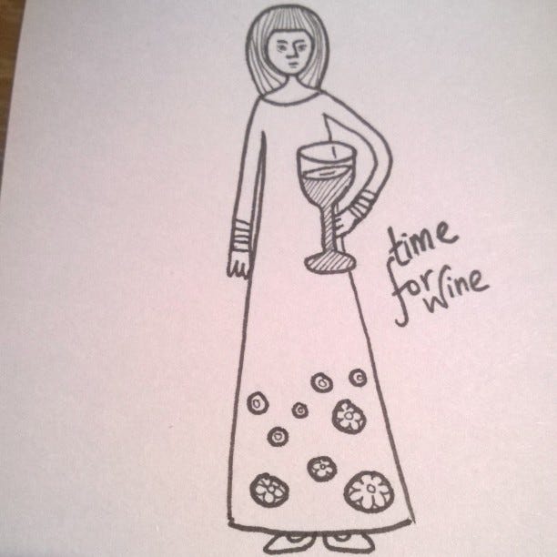
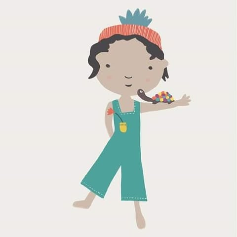
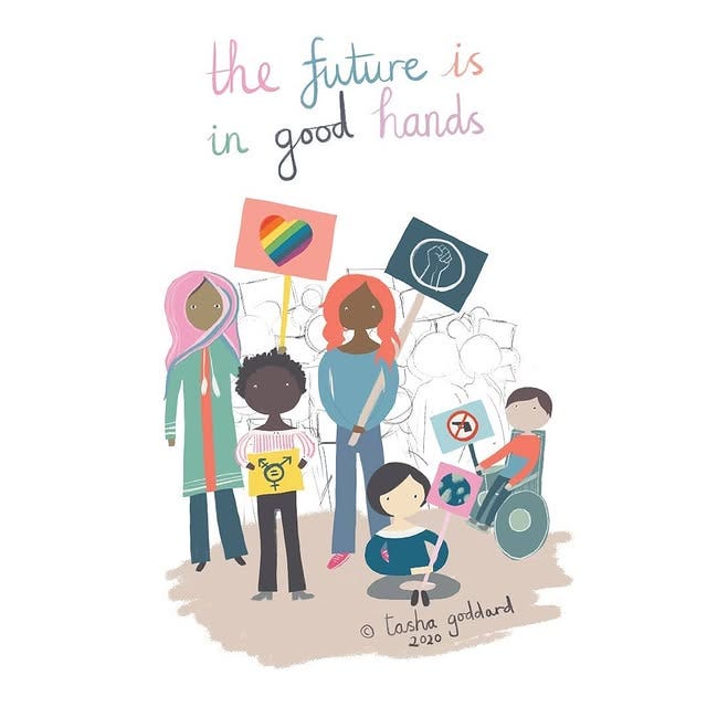
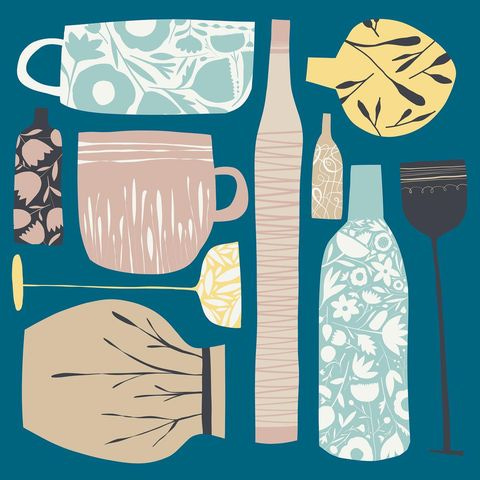
Here’s an IG timeline of some of my work over the years. I’ve tried to include a person, a pattern and some hand-lettering from each year and sometimes something else.
2014


2015


2016


2017


2018


2019


2020


2021


2022


2023


2024


Huh. And the above is why I can’t delete Instagram. (See last week’s post for why this is on my mind!)
Discoverability for illustrators

If you’re new here, I share weekly writing in the areas of illustration business, freelance life and travel, along with illustrations, new and old. Everything goes out for free, but paid subscriptions are very welcome if you enjoy finding my words or illustrations in your inbox.
You can skip forward to the end and read what I got out of my looking back to at old work in order to move forward in my creative voice. Or you can do the challenge yourself before seeing what I found!

I challenge you to go look back at some old work. Scroll back to the very start of your Instagram feed. Search your name on Pinterest or Google and see what old bits and pieces come up. Look through old sketchbooks, if you keep them. If you’ve been doing this for decades, do you have some books you’ve illustrated or products with your art on sitting on a shelf somewhere gathering dust? Pull them out. Whatever means you have to look back at some old work, take it. (My method was the easiest one. But I think I will do the same with sketchbooks if I have some time during the week.) And look back at them.
DO NOT look back with shame or disgust or disappointment. At least, try hard not to. You may not be able to switch off those initial reactions. Because it’s very very likely that your work has improved, or at the very least changed substantially in style or media, so it will almost certainly not be where your aesthetic or your voice is right now. Instead, close your eyes and take a series of deep breaths. And then look at them and try to step back into your head when you were creating them.
Can you remember where you drew that sketch? Can you remember what you were doing and what was going on around you? Can you step back into your colour choices for that piece? What tools were you using then? Can you think back to how you felt creating the picture (or whatever piece of creative output you’re looking back at – it might be a pattern, a piece of embroidery, a short story or poem, a sculpture…)? Can you remember what you struggled with? Can you step back into your feelings when you were making that piece? And how you felt when you finished it? Did you share it with those close to you, and can you remember how that felt? Did you share it wider? Or perhaps you didn’t feel able to share it?
What can you see that you would do differently now? Do you know more about human anatomy now, or perspective, or are your colour choices more refined? Do you work more loosely now, or more tightly? Has the subject matter you choose to depict changed significantly? Did you used to work more realistically or traditionally and now you stylise more, or perhaps the other way round?
Now I want you to pull out five old pieces of old work, ideally from different times in your creative life. If you have something that goes back to when you were a child or a teenager, include one of those, but other than that concentrate on your earlier pieces when you were starting to practise with more regularity – whether as a career, on a higher education course, or maybe as a dedicated hobby or passion). And now pull out five pieces of more recent work. Ideally, from the past 2–3 years, unless you’re very new to your practice, in which case just narrow it down to the last year or six months.
Make a timeline or path from these pieces (digitally or physically as you prefer, or whichever is easiest), from the earliest to the most recent.
Write down 5 things that you can see that have changed significantly in your work. Write down 5 things that haven’t changed and that tie your old work to your current work (I feel you should be able to find at least 5, but it may take some digging).
Try to pick at least 1 thing that you miss from your earlier work and would like to thread back into your practice. For example, this could be subject matter, a particular tool, texture or line work, a colour, stylisation or level of looseness.
Pick 1 change that you are particularly happy with and that you would like to push further in your practice. Maybe you’ve particularly improved how you stylise animals. Can you dig further into that? Why do you feel it’s better? Are there some extra tweaks you can make or is there something (tails, paws, fur) that you haven’t quite pushed far enough? Or maybe you’ve really changed your line work. Can you identify what’s working? Are you much looser? Is there a particular brush or tool that you use a lot and should you niche down further to only use it, or find a way to bring in one what you’re getting from that brush into one or two others, to get the same level of improvement there?
Imagine 5 more pieces placed on this path or timeline. What would you like to see there? Look again at the path or timeline. Close your eyes. Open them and look again. Close them and see the pictures inside your head. And now try to imagine the future 5 pieces. And write down anything further that comes from this introspection – whether it’s subject matter, technique, style – whatever it is.
Now set some smallish steps that you can take for moving forward in the way that you have visualised. For example, were you visualising an improvement in a particular skill? Make a plan to research some YouTube videos or books or Skillshare classes (whichever your favourite way to learn is) to go through and aim to have improved that skill by a certain amount by the end of next year. Or, if you identified that you used to draw a lot of animals and haven’t recently, make a goal to create at least one piece a month with an animal in it for the next year.

Here’s what I came up with from my own timeline.
Changed significantly
Lettering is much more considered. In earlier pieces it was mostly ‘just’ handwriting.
Colours are more consistent. I now draw from a consistent palette, that I update once or twice a year. I will include other colours, but only as extra pops or if I have to use a specific palette.
People’s proportions generally work better now. I have a better understanding of human anatomy and proportions and, even when simplifying and stylising, I think they ‘work’ better than they did.
More specifically, there are no insanely long necks anymore. I don’t honestly know where that came from. I don’t remember in any way trying to create a style by using them; I think it was actually that I didn’t see that they looked ridiculous!
Texture. This is a very recent addition. While I’ve experimented a bit with it over time, for the most part I have stuck with a plain and flat surface, even when working in traditional media, such as gouache or dippen, the paint was usually flat and opaque and the dippen would create marks and patterns, but not usually to depict traditional texture.
Stayed mostly the same
Colourful and bright (when not black and white)
Maximilist
Loose hand-drawn feel (even when drawn digitally, as more often than not these days)
Pattern & decoration used in some way in most pieces (except not so much on the food illustrations)
Quirky perspective. While I can draw realistic perspective and depth, I generally try and choose not to and to give an ‘off’ and somewhat askew or flattened perspective and depth, that evokes children’s drawings.
At least 1 thing I miss
Line – specifically black and white (or blue and white) dip pen. I do still draw a lot with fountain pen in my sketchbook and with fountain pen brushes on my iPad, I honestly can’t recall the last time I got the actual scritchy scratchy dip pens out. And I think there’s a certain something that comes from that, which even the most well-put-together digital brushes don’t quite hit. Because you don’t get the happy accidents there, I suppose.
Pattern – while this hasn’t disappeared entirely, it’s not really present in any of the food illustrations I’ve been working on for The Illustrated Plant Kitchen (though I have used some of the illustrations to create patterns for the post images), and I’ve not been making very many patterns from scratch. I would like to start making more patterns from illustrations I have created (for example, creating more scattered repeats of foodie spot illustrations, or pulling out some of the floral decorations I’ve added into the furniture A to Zs). And I would also like to dig deeper into adding pattern and decoration to the larger illustrations I make. So more patterned upholstery, or digging more into and emphasising the patterns found in nature.
At least 1 change I want to push further
Texture. I want to dig further into using texture. BUT… I want to do so while trying to reintegrate pattern and mark-making. I think some of the texture has replaced almost pattern-like mark-marking I would have used previously and I think this has caused a little bit of my voice to melt away. I don’t think I need to go fully back to only ever using complete flatness and not using any textured brushes. I am never going to give up practising my flat vector drawings, but I do really want to explore texture more and perhaps narrow the brushes I use even further down.
Drawing more people. I think I may have been avoiding drawing people this year. To some extent that’s because I’m trying to niche down and people are not a specific part of the niches I’m focusing on. But they can be included in some of them, especially the room illustrations. I do love creating room illustrations that depict emotion and character without having actual people in them, because I think that’s kinda cool and an interesting challenge. But… I have room illustrations I love that do include people and it would be fun to dig down further into that. I also really enjoyed looking at some Lowry paintings in Manchester a couple of weekends ago and really dig the way he could draw crowds that looked ‘right’ but with minimal brush strokes. I feel like there is a place for exploring that through the windows of some room illustrations, for example. And there could definitely be some scenes of people digging into and enjoying food – or cooking and preparing food. In addition to actual food illustrations.
Where I think the path will lead
I can’t show you the images inside my head of where I can see the other illustrations on my path going over the next few years. But I can tell you that there are more black and white illustrations in there, making use of dip pens, as well as dip pen style brushes, with lots of mark making and pattern in there. AND lots of rich, maximalist, colourful and textured room illustrations that include diverse people and all the little details and decorative nuggets I love to include. And there are patterns galore, drawing from food spot illustrations as well as pulling out from the decorative details in the main illustrations.
Some small tasks to build towards these goals
These are tasks to do outside of and in addition to client work. (That can be challenging sometimes, but this is not a huge amount to stick to, I feel, and should be enough to squeeze in even during busy periods.)
Get out the dip pens and ink and start drawing with them at least twice a week.
Pick one image (can be a piece of fine art, a photo in a magazine, an old advert, a still from a film, etc. etc.) each week to study, that includes a person, or people, and dig down into it. Look at the posture, the shapes, the sense of movement, how the clothing falls, and so on. Study it and fill at least one sketchbook spread with something you’ve got from that study.
Pick at least two illustrations a month to pull out patterns from – whether that’s putting together a scattered repeat of the ingredients from a particular illustrated recipe, or from that month’s veg letter; or grabbing some of the decorative elements in a room illustration or A to Z piece of furniture and making a hero pattern from it.
Dig down, in my sketchbook, into practising drawing people (diverse ages, postures, ethnicities, sizes, genders and abilities) and include at least one person a month in either a room illustration or foodie illustration.
I would love to know if you try this task! Tell me if there were any surprises, or share your steps for moving forward, if you like. (If you want to, I’d be happy for your thoughts on my timeline, too. It can often be easier to see from the outside, so there may be things (both progress and threads that carry through the whole decade) that I haven’t spotted.